---
title: "Portal Appearance"
description: "Customize portal visual themes, select dark mode styles, configure accent colors, and adjust UI animation and notification preferences."
---
## 📖 Introduction
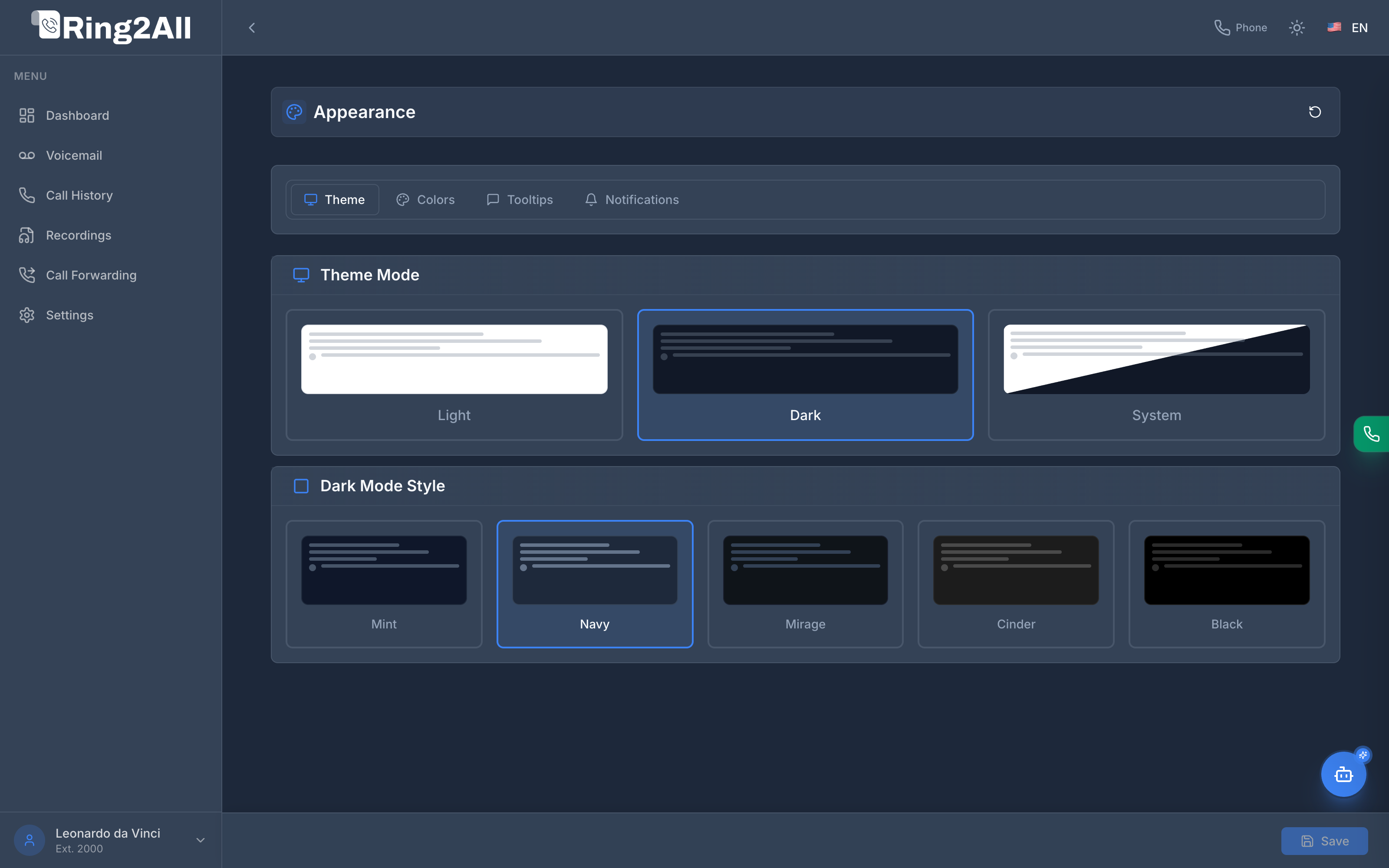
The **Appearance** module provides extensive personalization over the visual aesthetic of the User Portal. Subscribers can select between Light, Dark, or System themes, customize dark mode color palettes, choose primary accent tints, and control UI feedback for notifications and tooltips.
---
## 🎯 User Roles & Key Capabilities
| Role | Primary Use Case | Key Capabilities |
| :--- | :--- | :--- |
| **Enterprise Subscriber / Extension User** | Personal Workspace Comfort | Switch between corporate brand alignment or personalized ergonomic palettes, choose dark mode variants, and configure notifications. |
| **Contact Center Agent** | High-Volume Call Comfort | Leverage deep dark themes (Navy, Black) and high-visibility status badges to reduce eye fatigue during long calling queues. |
| **PBX Administrator** | Corporate Standard Setting | Audit how tenant brand colors populate the default Corporate Brand slot for all end-user extension portals. |
---
## 🎨 Theme Modes
Under the **Theme** tab, users can toggle the foundational color scheme:
| Mode | Visual Behavior |
| :--- | :--- |
| **Light** | Clean, high-luminance white background with crisp contrast for bright office environments. |
| **Dark** | Modern dark background that reduces eye strain in low-light conditions. |
| **System** | Automatically syncs the portal theme with the operating system's dark/light schedule. |
---
## 🌑 Dark Mode Styles
When **Dark** mode is active, subscribers can further refine their visual environment by choosing from five curated color grading styles:
| Style | Tone Characteristics | Optimal For |
| :--- | :--- | :--- |
| **Navy** (Default) | Deep oceanic slate blue with subtle cool undertones. | Balanced enterprise aesthetics. |
| **Mint** | Modern dark slate infused with subtle soft cyan and emerald undertones. | Modern tech & developer feel. |
| **Mirage** | Neutral cool industrial gray with minimal color tinting. | Maximum neutrality and readability. |
| **Cinder** | Warm charcoal and dark bronze hues. | Warm ambient office settings. |
| **Black** | Pure OLED pitch-black background with high-contrast text. | OLED displays and minimum battery consumption. |
---
## 📑 Additional Appearance Tabs
The tab bar provides granular controls across three supplementary dimensions:
```mermaid
graph LR
AppearanceTabs["Appearance Tabs"] --> Theme["Theme (Mode & Dark Palette)"]
AppearanceTabs --> Colors["Colors (Smart Preset Grid)"]
AppearanceTabs --> Tooltips["Tooltips (Delay & Visibility)"]
AppearanceTabs --> Notif["Notifications (Sound & Toast Feedback)"]
```
### 1. Colors & Smart Palette Hierarchy
The **Colors** tab governs portal interaction accents, primary buttons, dial pad highlights, and active call indicators through Ring2All's **Smart Coexistence & Hierarchy Model**:
#### Unified 7-Slot Preset Grid
| Slot | Preset Name | Swatch & Hex Details | Functional Role |
| :---: | :--- | :--- | :--- |
| **1** | **Corporate Brand**
*(Marca Corporativa)* | Dynamically bound to the tenant's corporate `primaryColor` and `secondaryColor` configured in **PBX Branding**. Shows dynamic badge: **Default** (`Por defecto`) or **Active**. | **Authoritative Default:** Inherited automatically via `useCorporateColors: true`. |
| **2** | **Carrier Blue** | `#3B82F6` Primary / `#60A5FA` Secondary | Crisp standard blue for bright office workstations. |
| **3** | **Emerald Green** | `#10B981` Primary / `#34D399` Secondary | Calming natural green for administrative users. |
| **4** | **Electric Purple** | `#8B5CF6` Primary / `#A78BFA` Secondary | High-energy violet for creative and tech teams. |
| **5** | **Crimson Red** | `#EF4444` Primary / `#F87171` Secondary | High-contrast urgent red for dispatch and alert teams. |
| **6** | **Amber Orange** | `#F59E0B` Primary / `#FBBF24` Secondary | Warm amber glow for low-light evening environments. |
| **7** | **Custom**
*(Personalizado)* | Interactive card featuring inline color picker swatches for custom primary and secondary tones. | Maximum personalization for individual users. |
#### Smart Hierarchy & Synchronization Engine (`useCorporateColors`)
1. **Automatic Corporate Inheritance (Default):** All subscriber accounts default to `useCorporateColors = true`. When the tenant administrator updates corporate colors in **PBX Branding**, the User Portal immediately adopts the new colors.
2. **Individual Freedom Without Conflicts:** If an employee chooses an alternative preset (Slots 2–6) or picks a custom color (Slot 7), `useCorporateColors` switches to `false`. Their visual choice is persisted and will not be overwritten by administrative brand updates.
3. **One-Click Realignment:** Clicking the **Corporate Brand** card at any time sets `useCorporateColors = true` and re-aligns the portal with the active corporate palette.
4. **Corporate Integrity:** Corporate logos, favicons, and copyright disclaimers remain fully protected and cannot be changed by portal subscribers.
#### Interactive Live Theme Preview Strip
A real-time preview strip below the preset swatches illustrates the effect on primary call action buttons, secondary badges, and focus rings.
### 2. Tooltips
Controls whether descriptive helper tooltips appear immediately on hover, after a short delay (500ms), or are disabled for experienced power users.
### 3. Notifications
Configures desktop push notification permissions, in-browser toast popup durations, and sound alert toggles when new voicemails or calls arrive.
---
## 💾 Saving Preferences
Click the **Save** button in the fixed bottom action bar to persist your appearance preferences to browser local storage and user database profile. Settings are instantly restored across subsequent logins.