

Branding Module Documentation
Table of Contents
Section titled “Table of Contents”- Navigation & Access
- Screenshots & Visual Interface
- 🎯 User Roles & Key Capabilities
- Module Overview (Technical)
- Module Overview (Commercial/Business)
- Module Overview (End User/Administrator)
- Configuration Sections
- Settings Reference
- Common Scenarios & Examples
- Model Context Protocol (MCP) AI Integration
- Limitations & Important Notes
- Troubleshooting Tips
- Glossary
Navigation & Access
Section titled “Navigation & Access”To access the Branding module:
- Log in to the Ring2All Web Portal (
https://<domain-or-ip>/login). - In the left navigation sidebar, expand Admin.
- Under System Settings, click Branding (
/admin/system-settings/branding). - To configure white-label branding for a specific tenant, click on the tenant row in the table or the edit action icon (
/admin/system-settings/branding/:id).
Screenshots & Visual Interface
Section titled “Screenshots & Visual Interface”Branding Tenants List View
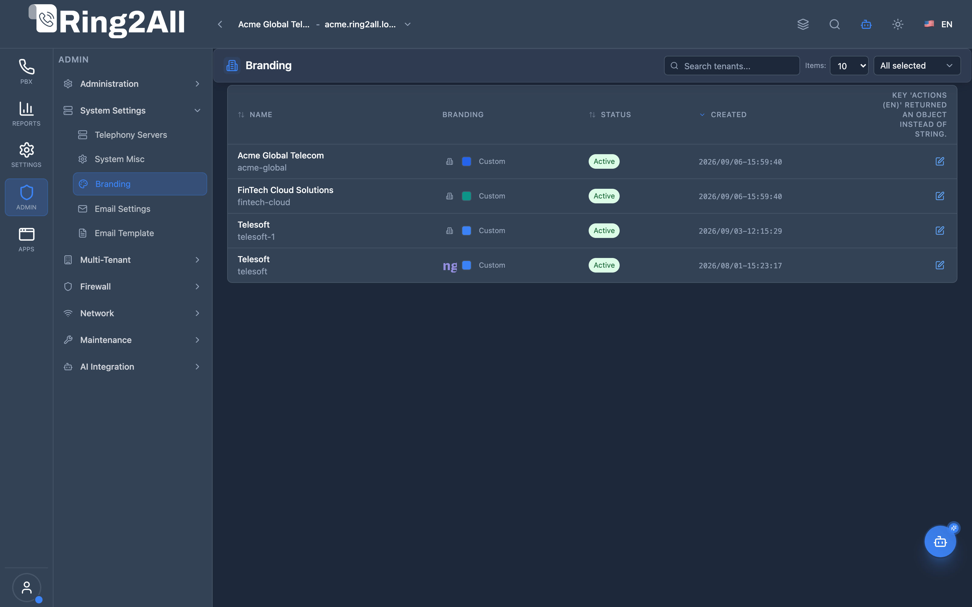
Section titled “Branding Tenants List View”The Branding overview displays all registered platform organizations and tenants, indicating corporate titles, slug identifiers, primary brand colors, admin contact emails, and customization statuses.
Tenant Branding Configuration Form
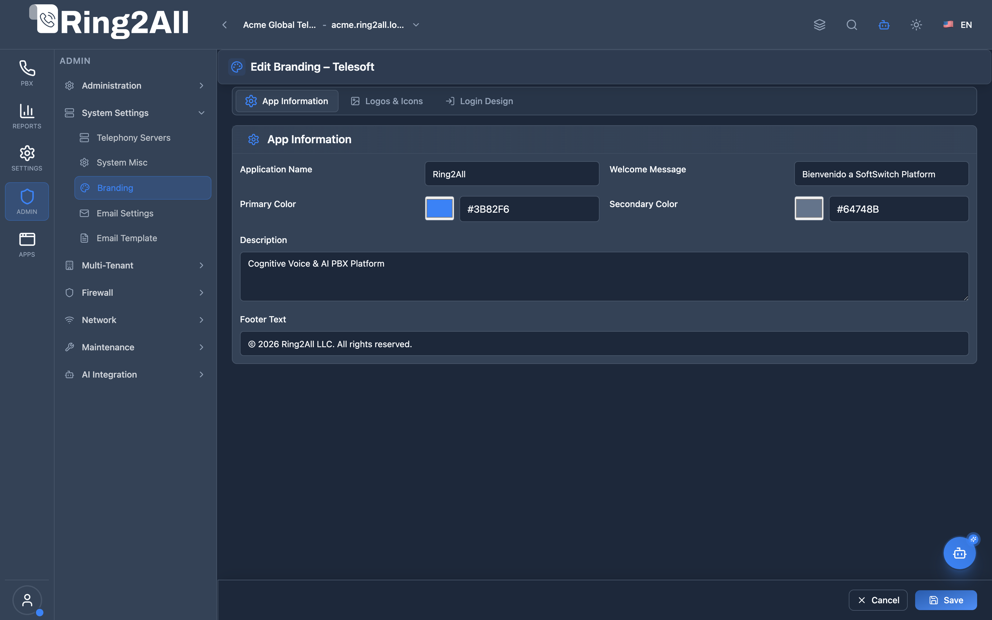
Section titled “Tenant Branding Configuration Form”The tenant branding editor provides comprehensive white-labeling controls, including custom application naming, logo asset uploads, favicon selection, brand color pickers (primary and secondary), and whitelabel footer copyright definitions.
🎯 User Roles & Key Capabilities
Section titled “🎯 User Roles & Key Capabilities”The Branding module manages white-label customization across multi-tenant enterprise partitions:
| Role | Key Capabilities & Operational Scope |
|---|---|
| Platform Owner / Master Administrator | Defines the global platform brand, default fallback logos, copyright texts, and grants white-label customization permissions to tenants. |
| Tenant Administrator | Personalizes the tenant’s visual identity: uploads corporate logos (light/dark modes), customizes primary theme colors, and sets company support links. |
| Marketing & Brand Specialist | Adjusts UI color palettes (HEX codes), verifies favicon contrast across browsers, and ensures branding assets render correctly across mobile and desktop interfaces. |
| Telephony Auditor (Read-Only) | Verifies tenant brand configurations, active logo URLs, and copyright strings without modification privileges. |
1. Module Overview (Technical)
Section titled “1. Module Overview (Technical)”What Is Branding?
Section titled “What Is Branding?”Branding is a white-labeling module that customizes the visual identity of each tenant. It manages logos, colors, login page design, and application information to match corporate branding.
Architecture
Section titled “Architecture”┌─────────────────────────────────────────────────────────────────┐│ Branding Architecture │├─────────────────────────────────────────────────────────────────┤│ ││ Branding Configuration ││ ┌──────────────────────────────────────────────────────────┐ ││ │ Tenant: Acme Corp │ ││ │ │ ││ │ App Information: │ ││ │ ├─ App Name: Acme PBX │ ││ │ ├─ Welcome Message: Welcome to Acme │ ││ │ └─ Footer: © 2025 Acme Corp │ ││ │ │ ││ │ Colors: │ ││ │ ├─ Primary: #1E40AF │ ││ │ └─ Secondary: #64748B │ ││ │ │ ││ │ Logos: │ ││ │ ├─ Desktop Light: acme-logo.png │ ││ │ ├─ Desktop Dark: acme-logo-dark.png │ ││ │ ├─ Mobile Light: acme-mobile.png │ ││ │ ├─ Mobile Dark: acme-mobile-dark.png │ ││ │ ├─ Favicon Light: favicon.ico │ ││ │ └─ Favicon Dark: favicon-dark.ico │ ││ │ │ ││ │ Login Design: │ ││ │ ├─ Background Color: #0F172A │ ││ │ ├─ Background Image: login-bg.jpg │ ││ │ ├─ Form Background: rgba(...) │ ││ │ └─ Button Color: #3B82F6 │ ││ │ │ ││ │ Notifications: │ ││ │ ├─ Toast Success: #10B981 │ ││ │ ├─ Toast Error: #EF4444 │ ││ │ ├─ Toast Warning: #F59E0B │ ││ │ └─ Toast Info: #3B82F6 │ ││ │ │ ││ └──────────────────────────────────────────────────────────┘ ││ │ ││ ▼ Applied to ││ ┌──────────────────────────────────────────────────────────┐ ││ │ User Interface │ ││ │ │ ││ │ ├─ Login page │ ││ │ ├─ Application header │ ││ │ ├─ Browser favicon │ ││ │ ├─ Mobile PWA icons │ ││ │ └─ Color scheme throughout │ ││ │ │ ││ └──────────────────────────────────────────────────────────┘ ││ │└─────────────────────────────────────────────────────────────────┘2. Module Overview (Commercial/Business)
Section titled “2. Module Overview (Commercial/Business)”Business Value
Section titled “Business Value”Branding provides complete white-labeling:
| Without Branding | With Branding |
|---|---|
| Generic interface | Custom identity |
| Default colors | Corporate colors |
| Platform logos | Customer logos |
| Same for all | Per-tenant customization |
Use Cases
Section titled “Use Cases”-
Reseller White-Label
- Rebrand for each customer
- Hide platform identity
-
Corporate Identity
- Match company colors
- Display company logo
-
Multi-tenant Differentiation
- Unique look per tenant
- Easy tenant identification
-
Professional Appearance
- Custom login page
- Branded experience
Feature Highlights
Section titled “Feature Highlights”| Feature | Benefit |
|---|---|
| Light/Dark Logos | Theme support |
| Desktop & Mobile | Responsive branding |
| Favicons | Browser identity |
| Color Customization | Match corporate colors |
| Login Design | Custom welcome pages |
| Per-Tenant | Multi-tenant branding |
3. Module Overview (End User/Administrator)
Section titled “3. Module Overview (End User/Administrator)”What Can You Do?
Section titled “What Can You Do?”- Set application name
- Upload logos (light/dark modes)
- Upload mobile logos
- Upload favicons
- Set primary and secondary colors
- Customize login page design
- Customize notification toast colors (Success, Error, Warning, Info)
- Set welcome message and footer
Branding Interface
Section titled “Branding Interface”┌─────────────────────────────────────────────────────────────────┐│ Branding │├─────────────────────────────────────────────────────────────────┤│ ││ Customize your tenant's visual identity and interface ││ ││ [🔍 Search tenants...] ││ ││ ┌───────────────────────────────────────────────────────────┐ ││ │ Tenant Name │ Branding │ Status │ Actions │ ││ ├─────────────────┼────────────┼───────────┼────────────────┤ ││ │ Acme Corp │ [Logo] │ ● Active │ [Configure] │ ││ │ Beta Inc │ [Default] │ ○ Inactive│ [Configure] │ ││ │ Gamma LLC │ [Logo] │ ● Active │ [Configure] │ ││ └───────────────────────────────────────────────────────────┘ ││ │└─────────────────────────────────────────────────────────────────┘App Information Section
Section titled “App Information Section”┌─────────────────────────────────────────────────────────────────┐│ App Information │├─────────────────────────────────────────────────────────────────┤│ ││ Application Name: [Acme PBX ] ││ The name of your application as it appears ││ ││ Welcome Message: [Welcome to Acme Communications] ││ Welcome message shown to users when they log in ││ ││ Description: [Enterprise phone system ] ││ Brief description of your application ││ ││ Footer Text: [© 2025 Acme Corp. All rights reserved.] ││ Footer text displayed at the bottom ││ ││ Primary Color: [#1E40AF ] [🎨] ││ Primary color used for buttons, links, and highlights ││ ││ Secondary Color: [#64748B ] [🎨] ││ Secondary color used for backgrounds ││ │└─────────────────────────────────────────────────────────────────┘Logos & Icons Section
Section titled “Logos & Icons Section”┌─────────────────────────────────────────────────────────────────┐│ Logos & Icons │├─────────────────────────────────────────────────────────────────┤│ ││ ▼ Desktop Logos ││ ││ Logo (Light Mode) Logo (Dark Mode) ││ ┌────────────────┐ ┌────────────────┐ ││ │ │ │ │ ││ │ [ACME] │ │ [ACME] │ ││ │ │ │ (white text) │ ││ └────────────────┘ └────────────────┘ ││ [Change] [Remove] [Change] [Remove] ││ 200x200px or larger 200x200px or larger ││ ││ ──────────────────────────────────────────────────────────────││ ││ ▼ Mobile Logos & Favicons ││ ││ Mobile (Light) Mobile (Dark) Favicon (Light) Favicon (Dark) ││ ┌──────────┐ ┌──────────┐ ┌──────────┐ ┌──────────┐ ││ │ [A] │ │ [A] │ │ [A] │ │ [A] │ ││ └──────────┘ └──────────┘ └──────────┘ └──────────┘ ││ 512x512px 512x512px 32x32px 32x32px ││ │└─────────────────────────────────────────────────────────────────┘Login Design Section
Section titled “Login Design Section”┌─────────────────────────────────────────────────────────────────┐│ Login Design │├─────────────────────────────────────────────────────────────────┤│ ││ Background Color: [#0F172A ] [🎨] ││ Background color for the login page ││ ││ Font Color: [#FFFFFF ] [🎨] ││ Font color for text on the login page ││ ││ Form Background: [#1E293B80 ] [🎨] ││ Background color for the login form (with alpha) ││ ││ Submit Button Color: [#3B82F6CC] [🎨] ││ Color for the submit button (with alpha) ││ ││ Add-ons Menu Color: [#47556980] [🎨] ││ Color for the add-ons menu ││ ││ Disable Background Image: ☐ ││ ││ Background Image: ││ ┌──────────────────────────────────────────────────────────┐ ││ │ │ ││ │ [Background Image Preview] │ ││ │ │ ││ └──────────────────────────────────────────────────────────┘ ││ [Change] [Remove] ││ ││ Login Logo: ││ ┌────────────────┐ ││ │ [ACME] │ ││ └────────────────┘ ││ [Change] [Remove] ││ ││ [Save] [Cancel] ││ │└─────────────────────────────────────────────────────────────────┘Quick Tips
Section titled “Quick Tips”[!TIP] Light & Dark: Upload both versions for theme support.
[!TIP] Recommended Sizes: Follow size guidelines for best quality.
[!NOTE] Alpha Colors: Use hex with alpha (e.g., #3B82F680) for transparency.
4. Configuration Sections
Section titled “4. Configuration Sections”App Information
Section titled “App Information”| Field | Description |
|---|---|
| Application Name | Display name |
| Welcome Message | Login greeting |
| Description | App description |
| Footer Text | Footer content |
| Primary Color | Main accent color (buttons, active tabs, highlight states) |
| Secondary Color | Background color |
Corporate Brand Propagation & User Appearance Hierarchy
Section titled “Corporate Brand Propagation & User Appearance Hierarchy”The Primary Color and Secondary Color configured here form the authoritative corporate palette for the entire organization:
- Automatic User Inheritance (
useCorporateColors: true): By default, all newly provisioned user accounts, extension portals, and administrative sessions inherit these corporate brand colors automatically. - Dynamic Synchronization: Whenever an administrator updates and saves the tenant’s brand colors in this module, the new palette propagates immediately in real-time to all users operating with corporate color synchronization enabled.
- The “Corporate Brand” Preset Slot: Within the Appearance > Colors tab of every user account across the PBX, SBC, BSS, Switchboard, and User Portal, these colors populate Slot 1 (“Corporate Brand / Marca Corporativa”) with an active status badge.
- Ergonomic Autonomy without Brand Compromise: Individual operators may select alternative ergonomic presets or custom hues for specialized lighting environments (which sets their personal
useCorporateColorsflag tofalse), but they can realign with the corporate identity at any time with a single click on the Corporate Brand card. Corporate logos, favicons, login designs, and legal watermarks remain strictly protected and can only be altered by administrators within this module.
Logos & Icons
Section titled “Logos & Icons”| Asset | Light Mode | Dark Mode | Size |
|---|---|---|---|
| Desktop Logo | ✓ | ✓ | 200x200px+ |
| Mobile Logo | ✓ | ✓ | 512x512px |
| Favicon | ✓ | ✓ | 32x32px |
Login Design
Section titled “Login Design”| Field | Description |
|---|---|
| Background Color | Page background |
| Font Color | Text color |
| Form Background | Login form background |
| Submit Button | Button color |
| Add-ons Menu | Menu accent |
| Background Image | Optional image |
| Login Logo | Login-specific logo |
5. Settings Reference
Section titled “5. Settings Reference”Recommended Image Sizes
Section titled “Recommended Image Sizes”| Asset | Size | Format |
|---|---|---|
| Desktop Logo | 200x200px+ | PNG, SVG |
| Mobile Logo | 512x512px | PNG |
| Favicon | 32x32px or 16x16px | ICO, PNG |
| Background | 1920x1080px | JPG, PNG |
Color Format
Section titled “Color Format”| Format | Example | Use |
|---|---|---|
| Hex 6-digit | #3B82F6 | Solid colors |
| Hex 8-digit | #3B82F680 | With alpha |
Alpha Values
Section titled “Alpha Values”| Alpha | Hex | Transparency |
|---|---|---|
| 100% | FF | Solid |
| 80% | CC | Slight |
| 50% | 80 | Half |
| 30% | 4D | Very transparent |
6. Common Scenarios & Examples
Section titled “6. Common Scenarios & Examples”Scenario 1: Basic Branding
Section titled “Scenario 1: Basic Branding”- Configure Branding for tenant
- Set Application Name
- Upload light mode logo
- Set Primary Color
- Save
Scenario 2: Full White-Label
Section titled “Scenario 2: Full White-Label”- Configure Branding
- Upload all logos (light/dark)
- Upload mobile logos
- Upload favicons
- Set all colors
- Customize login page
- Upload login background
- Save
Scenario 3: Login Page Customization
Section titled “Scenario 3: Login Page Customization”- Open Login Design section
- Set background color
- Upload background image
- Set form background with alpha
- Set button color
- Upload login logo
- Save
Scenario 4: Dark Mode Support
Section titled “Scenario 4: Dark Mode Support”- Upload light mode logo
- Upload dark mode logo (inverted/light colors)
- Upload both favicon versions
- Save
- Interface switches automatically
Model Context Protocol (MCP) AI Integration
Section titled “Model Context Protocol (MCP) AI Integration”The Ring2All PBX platform provides Model Context Protocol (MCP) tools for programmatic inspection of white-label branding configurations.
MCP Tools Reference
Section titled “MCP Tools Reference”| Tool Name | Operation | Description | Risk Level |
|---|---|---|---|
get_branding_settings |
Read | Retrieves white-label branding parameters (brand name, theme colors, logos, favicon) for the active tenant. | Low |
JSON Schema Definitions
Section titled “JSON Schema Definitions”get_branding_settings
Section titled “get_branding_settings”{ "name": "get_branding_settings", "description": "Retrieves white-label branding parameters (company brand name, theme colors, logo URLs, favicon) for the active tenant.", "parameters": { "type": "object", "properties": { "tenant_id": { "type": "number", "description": "Optional numeric tenant identifier (defaults to active tenant)" } } }}Natural Language Prompt Examples
Section titled “Natural Language Prompt Examples”English
Section titled “English”- “What brand name and primary theme color are configured for this tenant?”
- “Check the desktop light and dark logo URLs configured for the active organization.”
- “Show the white-label copyright text displayed on the login page footer.”
Spanish
Section titled “Spanish”- “¿Cuál es el nombre de marca y color primario configurado para esta empresa?”
- “Muestra los enlaces de los logos para modo claro y oscuro del tenant activo.”
- “Consulta el mensaje de bienvenida y pie de página de la marca blanca.”
Enterprise Safeguards & Guardrails
Section titled “Enterprise Safeguards & Guardrails”- Multi-Tenant Isolation: Tenant administrators can only query branding parameters associated with their own
tenant_id. - Safe Fallbacks: If custom tenant branding has not been configured, the tool automatically provides standard platform fallback assets.
7. Limitations & Important Notes
Section titled “7. Limitations & Important Notes”Technical Notes
Section titled “Technical Notes”[!NOTE] Per-Tenant: Each tenant has separate branding.
[!NOTE] Cache: Changes may require cache clear.
[!WARNING] Image Quality: Use high-resolution images.
Best Practices
Section titled “Best Practices”- Consistent Colors: Match corporate palette
- Both Themes: Provide light and dark variants
- Proper Sizes: Follow recommended dimensions
- Test Logos: Verify on different backgrounds
- Mobile-First: Ensure mobile logos are clear
Image Guidelines
Section titled “Image Guidelines”| Guideline | Recommendation |
|---|---|
| Format | PNG for transparency |
| Background | Transparent preferred |
| Quality | High resolution |
| Size | At least recommended |
8. Troubleshooting Tips
Section titled “8. Troubleshooting Tips”Common Issues
Section titled “Common Issues”| Symptom | Possible Cause | Solution |
|---|---|---|
| Logo not showing | Upload failed | Re-upload |
| Colors wrong | Cache | Clear browser cache |
| Blurry logo | Too small | Use larger image |
| Dark mode broken | Missing dark logo | Upload dark variant |
Verify Active Branding Configuration
Section titled “Verify Active Branding Configuration”- Administrative Portal Verification: Navigate to Admin > System Settings > Branding and confirm the preview swatches and asset thumbnails display the expected tenant configuration.
- User Appearance Confirmation: Access User Avatar > Appearance > Colors to verify that Slot 1 displays the updated corporate colors with the Corporate Brand badge active.
- Login Portal Validation: Open a private/incognito browser window and navigate to the tenant login URL to confirm the updated logo, wallpaper, and welcome messages render cleanly.
Clear Cache
Section titled “Clear Cache”- Browser: Ctrl+Shift+R (hard refresh)
- Application: Clear app cache
- CDN: Invalidate if applicable
9. Glossary
Section titled “9. Glossary”| Term | Definition |
|---|---|
| Branding | Visual identity customization |
| White-Label | Remove platform identity |
| Favicon | Browser tab icon |
| Alpha | Transparency value |
| PWA | Progressive Web App |
Documentation last updated: January 2026