

Appearance & Theme Customization Module Documentation
Module Code:
billing/client/appearance-theme
Route:/portal/settings/appearance
Frontend Store:useThemeStore.ts(Zustand / LocalStorage)
Styling Framework: Tailwind CSS 3.4 / CSS Variables
Brand Purity: 100% White-Label Compliant (Ring2All Billing)
Table of Contents
Section titled “Table of Contents”- Executive Summary & Personalized User Experience
- Technical Architecture & CSS Variable Engine
- 🎯 User Roles & Key Capabilities
- Visual Interface & Screen Breakdown
- Theme Modes, Dark Variants & Color Presets
- Interactive Theme Previews & Border Radius Engine
- Local Storage Persistence & State Hydration
- Diagnostic CLI & Operational Playbooks
- Domain Glossary
1. Executive Summary & Personalized User Experience
Section titled “1. Executive Summary & Personalized User Experience”The Appearance & Theme Customization module provides subscribers with granular control over the visual presentation of their self-care portal, including dark/light mode toggling, color palette presets, and corner border-radius styling.
+-------------------------------------------------------------------------------+| COMMERCIAL & OPERATIONAL IMPACT |+-------------------------------------------------------------------------------+| • Reduced Visual Fatigue: High-contrast Dark Mode options tailored for NOC || operators and enterprise technicians working night shifts. || • Corporate Brand Alignment: Allows enterprise subscribers to match portal || accent colors with their corporate visual identity. || • Instant Zero-Reload Switching: Theme mutations apply in real time via CSS || variable injection without requiring browser page refreshes. || • Persistent Multi-Device Experience: Client preferences are cached locally || in browser storage and optionally synchronized to customer user settings. |+-------------------------------------------------------------------------------+2. Technical Architecture & CSS Variable Engine
Section titled “2. Technical Architecture & CSS Variable Engine”Theme modifications update a centralized Zustand store, which injects runtime HSL/RGB CSS variables directly into the document root element (:root / html):
┌────────────────────────────────────────────────────────────────────────┐ │ Appearance Controls (AppearancePage.tsx) │ │ Mode: 'dark' | Variant: 'navy' | Color: '#3B82F6' │ └───────────────────────────────────┬────────────────────────────────────┘ │ ▼ updateThemePrefs() ┌────────────────────────────────────────────────────────────────────────┐ │ Zustand Theme Store (useThemeStore.ts) │ │ • Evaluates System Media Query Precedence │ │ • Computes Primary HSL, Background & Foreground Tokens│ └─────────────────┬──────────────────────────────────┬───────────────────┘ │ │ LocalStorage │ Cache DOM Mutation │ documentElement ▼ ▼ ┌───────────────────────────────────┐ ┌─────────────────────────────────┐ │ Browser LocalStorage │ │ Document Root (:root) │ │ Key: 'theme_preferences' │ │ --primary: 217 91% 60%; │ │ Payload: JSON ThemePrefs │ │ --radius: 0.5rem; │ │ │ │ class="dark navy-theme" │ └───────────────────────────────────┘ └─────────────────────────────────┘3. 🎯 User Roles & Key Capabilities
Section titled “3. 🎯 User Roles & Key Capabilities”Visual personalization is accessible to all portal users independently:
| User Role | Access Level | Primary Operational Capabilities |
|---|---|---|
| All Portal Users / Operators | Individual Preferences | Toggles dark/light modes, selects preferred color accents, customizes card radius. |
| Enterprise Account Administrator | Corporate Branding | Tests and recommends default color presets for internal department operators. |
| NOC Dispatcher | Night-Shift Optimization | Selects deep dark themes (Pitch Black or Deep Navy) to reduce eye strain in monitoring rooms. |
4. Visual Interface & Screen Breakdown
Section titled “4. Visual Interface & Screen Breakdown”4.1 Appearance & Theme Customization View
Section titled “4.1 Appearance & Theme Customization View”The configuration page features interactive cards and real-time live preview widgets:
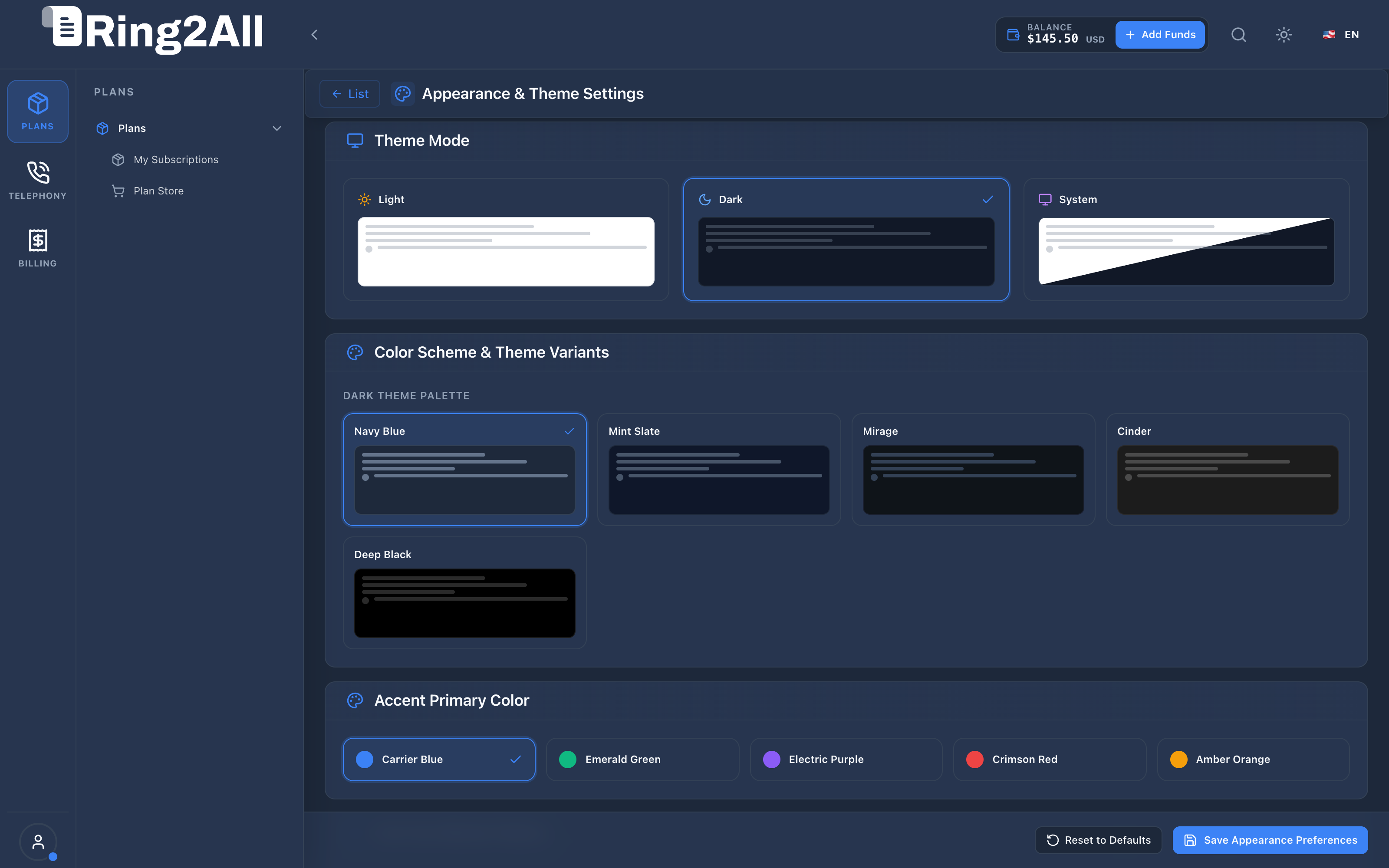
- Theme Mode Selector: Radio cards for
Dark Mode,Light Mode, andSystem Automatic(syncs with OS preferences). - Dark Mode Variants: Nuanced background choices including
Deep Navy,Slate Gray,Pitch Black (OLED), andEmerald Night. - Color Presets & Smart Palette Hierarchy: Unified 7-slot interactive card grid featuring the carrier’s Corporate Brand as Slot 1, 5 curated presets, and an inline custom picker.
- Border Radius Slider: Slider adjusting UI curvature from
0.0rem(sharp square) to1.0rem(curved modern). - Live Theme Preview: Instant interactive preview strip showing simulated data cards, call-to-action buttons, ghost buttons, and billing status badges.
5. Theme Modes, Dark Variants & Color Presets
Section titled “5. Theme Modes, Dark Variants & Color Presets”Unified 7-Slot Preset Grid & Smart Palette Hierarchy
Section titled “Unified 7-Slot Preset Grid & Smart Palette Hierarchy”Ring2All BSS features a Smart Coexistence & Hierarchy Model that balances wholesale carrier brand governance with individual subscriber visual preferences.
| Slot | Preset Name | Swatch & Hex Values | Functional Role |
|---|---|---|---|
| 1 | Corporate Brand (Marca Corporativa) |
Dynamically bound to the carrier’s corporate primaryColor and secondaryColor configured in BSS White-Label Branding. Displays dynamic badge: Default (Por defecto) or Active. |
Authoritative Default: Inherited automatically via useCorporateColors: true. |
| 2 | Carrier Blue | #3B82F6 Primary / #60A5FA Secondary |
Classic telecom corporate portal aesthetic. |
| 3 | Emerald Green | #10B981 Primary / #34D399 Secondary |
Recommended for finance, accounting, and billing managers. |
| 4 | Electric Purple | #8B5CF6 Primary / #A78BFA Secondary |
Modern high-tech SaaS look for enterprise cloud portals. |
| 5 | Crimson Red | #EF4444 Primary / #F87171 Secondary |
High-visibility contrast for urgent billing and credit monitoring. |
| 6 | Amber Orange | #F59E0B Primary / #FBBF24 Secondary |
Warm carrier billing and retail merchant styling. |
| 7 | Custom (Personalizado) |
Interactive card featuring inline color picker swatches for custom primary and secondary hex values. | Complete aesthetic autonomy for corporate client accounts. |
Smart Hierarchy & State Synchronization (useCorporateColors)
Section titled “Smart Hierarchy & State Synchronization (useCorporateColors)”- Carrier Brand Inheritance (Default): All subscriber and operator accounts default to
useCorporateColors = true. When the service provider or wholesale carrier updates corporate brand colors in BSS Admin Branding, the customer self-care portal automatically and instantly reflects the new color identity. - Subscriber Personal Override: When a customer selects an alternative color preset (Slots 2–6) or picks a custom color (Slot 7),
useCorporateColorsswitches tofalse. Their visual choice is persisted in browser local storage and will not be overwritten by future carrier branding modifications. - One-Click Brand Realignment: If the subscriber wishes to return to the official carrier branding, clicking the Corporate Brand card immediately sets
useCorporateColors = trueand re-synchronizes with the carrier’s brand tokens. - Brand Security & Integrity: Subscriber customization is strictly limited to accent highlights and dark/light modes. Carrier logos, invoice headers, tax numbers, and legal copyright notices remain immutable and fully controlled by the service provider.
6. Interactive Theme Previews & Border Radius Engine
Section titled “6. Interactive Theme Previews & Border Radius Engine”Adjusting the corner radius slider modifies the CSS variable --radius, which automatically propagates to all buttons, input fields, modals, and container boxes:
:root {  --radius: 0.5rem; /* Default rounded */}
.rounded-xl {  border-radius: calc(var(--radius) + 4px);}
7. Local Storage Persistence & State Hydration
Section titled “7. Local Storage Persistence & State Hydration”Preferences are preserved across sessions and tabs via the client storage key theme-preferences:
- On application boot in
index.html, an inline initialization script reads the cached mode to prevent “flash of unstyled content” (FOUC) before React hydrates.
8. Diagnostic CLI & Operational Playbooks
Section titled “8. Diagnostic CLI & Operational Playbooks”Inspect Browser Theme State via Console
Section titled “Inspect Browser Theme State via Console”// Open DevTools in Portal Browserconsole.log(localStorage.getItem('theme_preferences'));console.log(getComputedStyle(document.documentElement).getPropertyValue('--primary'));9. Domain Glossary
Section titled “9. Domain Glossary”- FOUC: Flash of Unstyled Content occurring when theme stylesheets load after initial DOM render.
- OLED Black: Pure
#000000background optimizing energy efficiency on mobile and OLED monitors. - System Mode: Dynamic mode synchronization that listens to OS
prefers-color-schememedia queries.