

Theme & Appearance Settings
Table of Contents
Section titled “Table of Contents”- Overview
- Operational & Ergonomic Value
- 🎯 User Roles & Key Capabilities
- Visual Interface & Theme Options
- Configuration & Style Reference
- Ergonomic Best Practices
- Troubleshooting & Verification
- Glossary
1. Overview
Section titled “1. Overview”The Theme & Appearance Settings module in Ring2All SBC provides operators with ergonomic control over the visual presentation, color contrast, and palette styling of the web management interface. Designed specifically for mission-critical telecom environments—ranging from brightly lit control rooms to darkened Network Operations Centers (NOCs)—the appearance system supports dynamic theme switching, multiple dark-mode variants, and custom accent color highlights.
The rendering engine leverages dynamic CSS variables and Tailwind theme tokens, applying styling adjustments instantaneously across all navigation panels, telemetry widgets, data grids, and modals without requiring a page reload.
2. Operational & Ergonomic Value
Section titled “2. Operational & Ergonomic Value”- NOC Eye Comfort & Fatigue Reduction: 24/7 telecom monitoring requires high-contrast, low-glare interfaces. Tailored dark-mode variants (such as Navy, Mirage, and Cinder) dramatically reduce eye strain during extended night shifts.
- OLED Power Optimization: The pure Black dark-mode variant turns off pixels on OLED and mini-LED displays, maximizing hardware energy efficiency and delivering deep visual contrast.
- Instantaneous Customization: Visual settings are applied immediately through reactive DOM state injection and persisted to browser local storage.
3. 🎯 User Roles & Key Capabilities
Section titled “3. 🎯 User Roles & Key Capabilities”| Role | Key Capabilities |
|---|---|
| NOC Operator / Engineer | Personalize interface contrast, switch between dark and light themes, and select high-visibility accent colors for rapid metric scanning. |
| SBC Administrator | Configure default organizational display modes and customize accent styles across administrative consoles. |
| Support Specialist | Adapt workspace contrast for varied ambient lighting conditions during remote debugging sessions. |
4. Visual Interface & Theme Options
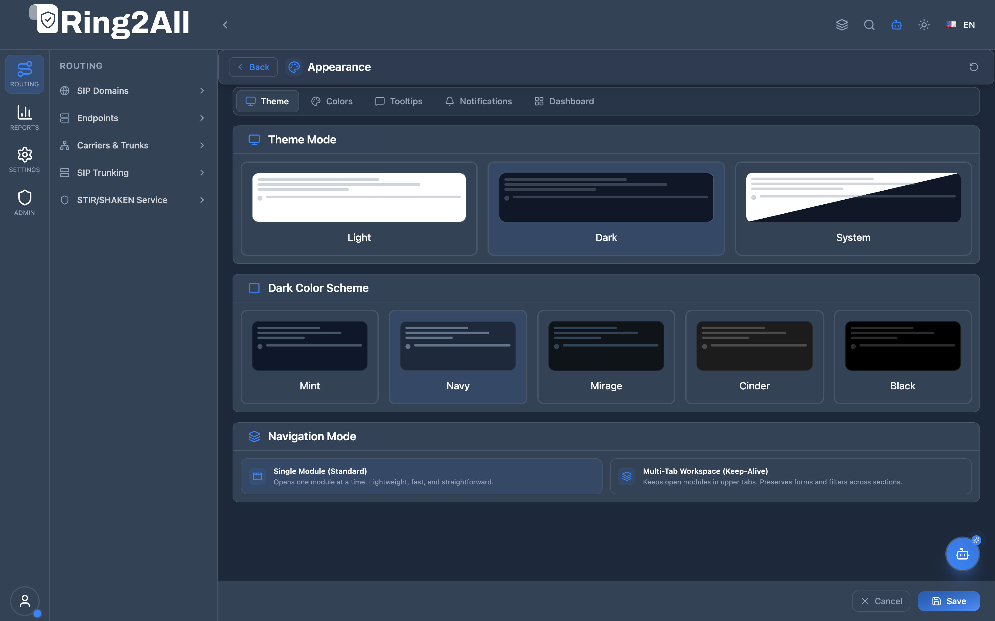
Section titled “4. Visual Interface & Theme Options”The Appearance interface features structured panels for theme mode selection, specialized dark-mode palette variants, and accent highlights.
5. Configuration & Style Reference
Section titled “5. Configuration & Style Reference”Theme Modes
Section titled “Theme Modes”| Mode | Visual Characteristics | Recommended Environment |
|---|---|---|
| System | Automatically tracks the client operating system’s light or dark mode preference via prefers-color-scheme. |
General desktop usage with dynamic daytime/nighttime OS switching. |
| Light | High-luminance white and soft-gray background surfaces with crisp dark typography. | Bright office environments, executive presentations, and daylight operations. |
| Dark | Low-emission dark backgrounds with tuned contrast borders and vibrant accent indicators. | 24/7 Network Operations Centers, low-light server rooms, and night shifts. |
Dark Mode Variants
Section titled “Dark Mode Variants”When Dark Mode is selected, operators can fine-tune the ambient color temperature across several specialized palettes:
| Variant Name | Color Profile / Hex Tone | Visual Characteristics |
|---|---|---|
| Mint | #0f172a with subtle sage/emerald undertones |
Refreshing, cool-toned dark surface providing soft visual separation. |
| Navy | #0a192f / #0f172a deep midnight blue |
Deep blue canvas commonly preferred by telecom engineers for long shifts. |
| Mirage | #1e1e2d slate-purple base |
Sophisticated, balanced dark palette with muted contrast lines. |
| Cinder | #18181b neutral charcoal gray |
Standard industrial dark mode with true neutral gray tones. |
| Black | #000000 absolute true black |
Maximum contrast, zero backlight emission on OLED screens. |
Accent Colors & Smart Palette Hierarchy
Section titled “Accent Colors & Smart Palette Hierarchy”The Colors panel governs administrative button highlights, active navigation indicators, focus outlines, and status badges. Ring2All SBC incorporates a Smart Coexistence & Hierarchy Model that balances organizational brand governance with NOC operator visual ergonomics.
Unified 7-Slot Preset Grid
Section titled “Unified 7-Slot Preset Grid”| Slot | Preset Name | Palette & Primary / Secondary Hex | Operational Role |
|---|---|---|---|
| 1 | Corporate Brand (Marca Corporativa) |
Dynamically reads and displays the corporate primaryColor and secondaryColor configured in SBC White-Label Branding. Displays dynamic badge: Default (Por defecto) or Active. |
Authoritative Default: Inherited automatically via useCorporateColors: true. |
| 2 | Carrier Blue | #3B82F6 Primary / #60A5FA Secondary |
Classic high-contrast blue for general daytime administration. |
| 3 | Emerald Green | #10B981 Primary / #34D399 Secondary |
Soft emerald hue optimal for trunk monitoring and traffic routing. |
| 4 | Electric Purple | #8B5CF6 Primary / #A78BFA Secondary |
High-vibrancy purple for visual telemetry dashboards. |
| 5 | Crimson Red | #EF4444 Primary / #F87171 Secondary |
High-urgency scheme for NOC incident response and alarm centers. |
| 6 | Amber Orange | #F59E0B Primary / #FBBF24 Secondary |
Warm amber tone for night-shift eye comfort. |
| 7 | Custom (Personalizado) |
Inline native color pickers for primary and secondary accent tones. | Allows exact Hex/RGB matching for specialized monitor calibrations. |
Smart Hierarchy & Synchronization Engine (useCorporateColors)
Section titled “Smart Hierarchy & Synchronization Engine (useCorporateColors)”- Automatic Brand Alignment (Default): All newly provisioned administrator and operator sessions default to
useCorporateColors = true. When an SBC Super Administrator modifies the primary or secondary brand colors in Branding, the changes synchronize instantly and automatically across all sessions inheriting corporate colors. - NOC Ergonomic Override: When an operator selects an alternative preset (Slots 2–6) or sets custom hues (Slot 7) to adapt to low-light monitoring rooms,
useCorporateColorsswitches tofalse. The personal selection is preserved and will not be overwritten by administrative branding updates. - One-Click Realignment: Operators can return to the organization’s corporate identity at any moment by clicking the Corporate Brand card, which re-enables
useCorporateColors = trueand updates all theme variables. - Brand Asset Protection: SBC system logos, favicons, login wallpapers, and copyright footers remain strictly administrative assets. Operators can only adjust their personal accent highlights.
Interactive Live Theme Preview Strip
Section titled “Interactive Live Theme Preview Strip”Directly beneath the swatches, an interactive preview strip validates the selected palette in real time:
- Primary Button: Tests fill contrast, hover states, and active state transitions.
- Secondary Button: Previews ghost borders and subtle background fills.
- Status Badges: Shows primary and secondary badges with alpha-blended backgrounds.
- Input Focus Ring: Confirms outline visibility against dark-mode surfaces.
Visual Density
Section titled “Visual Density”- Compact Density: Toggles high-density data grid spacing for displaying maximum rows of SIP accounts, routes, and real-time CDR streams on multi-monitor NOC displays.
6. Ergonomic Best Practices
Section titled “6. Ergonomic Best Practices”- Use Navy or Cinder for Extended NOC Shifts: Neutral dark palettes provide the highest legibility for reading dense SIP ladder diagrams and packet hex dumps without visual haloing.
- Match Ambient Lighting: If operating in a sunny room or training environment, switch to Light Mode to maintain sharp readability on matte anti-glare monitors.
- Utilize Black Variant on Mobile / OLED: When accessing the SBC console via portable tablets or OLED displays during field dispatches, the Black palette provides superior contrast and battery longevity.
7. Troubleshooting & Verification
Section titled “7. Troubleshooting & Verification”| Issue / Symptom | Root Cause | Resolution |
|---|---|---|
| Appearance reverts to Light Mode upon browser restart | Browser cookies/local storage cleared on exit | Check browser settings to ensure local storage persistence is permitted for the SBC domain. |
| Theme does not toggle when OS mode changes | Mode explicitly locked to Light or Dark | Select the System mode option to re-enable OS synchronization. |
| Accent color not visible on specific buttons | Browser extension forcing custom CSS overrides | Temporarily disable third-party style injection extensions (e.g., Dark Reader). |
8. Glossary
Section titled “8. Glossary”- Dark Mode Variant: A specialized color temperature applied to dark UI surfaces (e.g., cool blue, warm charcoal, pure black).
- CSS Variable: Native browser style token dynamically updated at runtime to restyle elements without full stylesheet recompilation.
- OLED: Organic Light Emitting Diode display technology where individual pixels illuminate independently and turn off completely for true black.